Sainsbury's Groceries App

The brief
At the time of release Sainsbury’s were the only competitive British supermarket to not have a mobile app in the market. So the brief was to build an app that would assist customers in shopping ‘wherever and whenever’.

Where it all began
It all started when the Head of Digital made a decision that Sainsbury’s needed a mobile app. I was involved in the very early conversations discussing current mobile app usage, how mobile apps were enriching the experience in groceries, what Sainsbury’s needed to do to cater for their customers and technically what we were capable of building.

From this point, there was a deep discovery phase where we gathered insights from across the business and from many third parties. My knowledge from working on the groceries site and the checkout in particular was also very helpful at this point as I was able to bring forward known customer pain points that could also be alleviated by an app.

Initial release
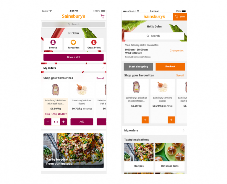
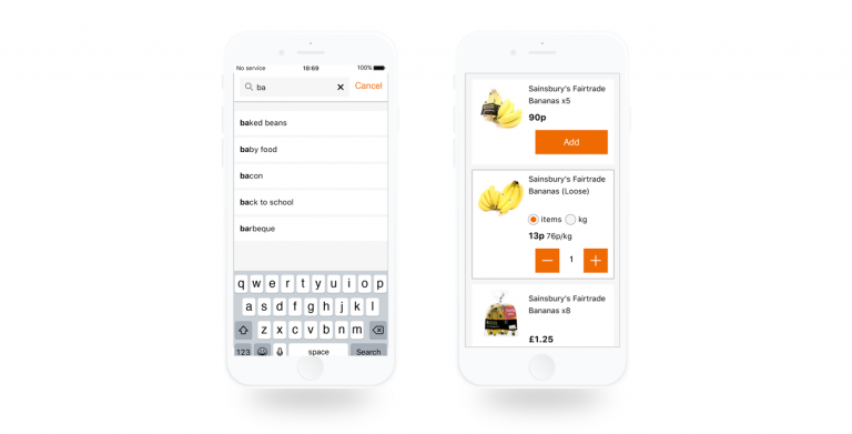
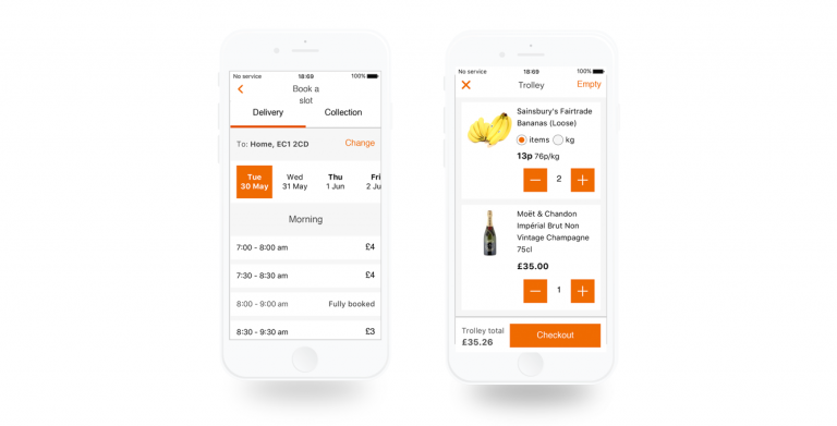
We were very aware that we were late to the market when it came to the groceries app therefore the decision was taken, very early on, that the initial release of the app would be a hybrid of the Sainsbury’s groceries website. This meant there would be little room for design changes. But as our discovery work had considered avenues for if we built a hybrid and/or native app, it gave us time to then start thinking about how we would iterate on the app and eventually seamlessly switch it over to be a fully native app. 

User testing 
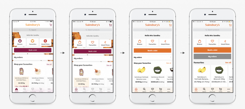
Although we expected the hybrid app would create barriers for customers to do what they wanted to do, user testing at this stage gave us the opportunity to validate whether Sainsbury’s would benefit from a mobile app, as well as help us create a clear list of customer pain points and desired features for future iterations. 

Sainsbury's App experience mapping
Sainsbury's App experience map and user research notes

Design and validation
The design was a huge part of the app both in terms of UX and UI. Throughout this project I worked closely with a UI Designer to bring to life the wireframes I mostly focussed on. I spent a lot of my time working through user journeys and drawing up wireframes of sections of the app, which were then used to demonstrate to the Product Owner and the Developers how we envisaged certain things to work. And they were regularly presented to stakeholders so they were aware of what we were working on. 

Sainsbury's App wireframing
Sainsbury's App wireframes and annotations

Development
The build of the app was a long and continuous project, that still continues today, due to the popularity and overall success of the app. It remained as a hybrid app for some time, but with the help of Pivotal Labs, an agile software development consulting firm, it took almost a year to move the app over to be a fully functioning iOS and Android native app, that also worked on tablet devices. 

Working with Pivotal Labs brought a new way of working for Sainsbury’s, with smaller product teams which more autonomy and focus to the entire team. It was also a shift in emphasising the customers and putting the users first – something I had been pushing for the entire time of working on the app but naturally at times got put on the back-burner due to technical reasons and at times stakeholder dominance. 

Introducing new the brand
During my time on this project, there was a large piece of working happening working on Sainsbury’s style and brand. This covered not only the digital side of design but also included the look and feel in-stores and on marketing material, and anything else you could think of. 

This was something we were keen to push ahead with in the app to give a more refreshed, modern look to the app. For such a big change within the company, many stakeholders were nervous for the change and so we took it upon ourselves to be the first to implement the new design and tested the impact, if any, that the new design would have. As we had expected the results were only positive and the new clean design was very much welcomed by our users. 

Sainsbury's Groceries App new design test

As we had expected the results were only positive and the new clean design was very much welcomed by our users. Once this was communicated to the stakeholders, it was then up to us to work on how we could progressively introduce these changes into the app without causing customers any friction. So we took an iterative approach, working closely with the Developers. We introduced a Dev/Design hour (or at times it easily became the whole afternoon) into each sprint where a Designer would pair with a Developer and we would work through a set of small design changes. 

Sainsbury's App new design iterations

The outcome
The app is still running now and is used by thousands of customers on a weekly basis; bringing in around a half of the groceries online sales.

The app was also featured in several talks and interviews with our Head of Digital Experience, Charlotte Briscall, such as this one in the Creative Review.

Role

UX Designer
User Researcher

Medium

Mobile apps
(Apple HIG Design &
Google Material Design)

Designed & built by me