The brief
Since the launch of Sainsbury’s Groceries online it was known that a significant number of online sales were being lost with a large majority of customers dropping out at the checkout stage. Therefore there was a desire to reduce this number.
What I did
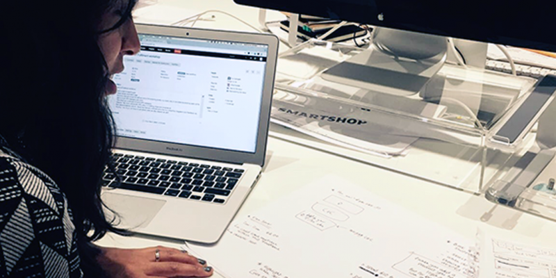
I joined this project after the discovery and framing had happened, and so I began by going over the results and gathering more insights that could help us better understand why customers were abandoning their trolley and identify other pain points that were being experienced.
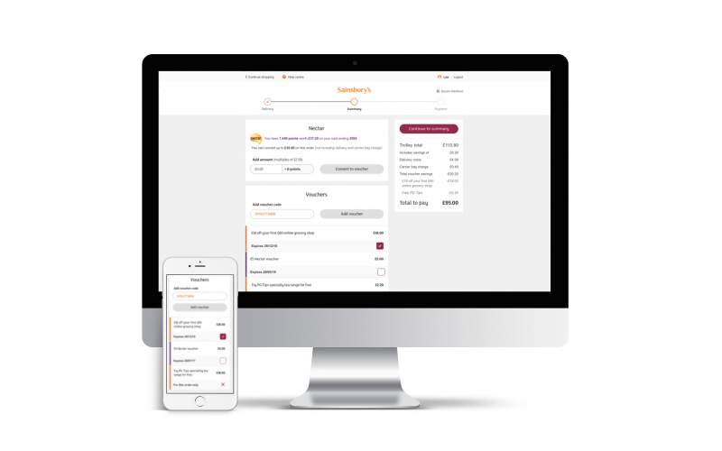
Discovery and data collection for Sainsbury's Checkout
Designing
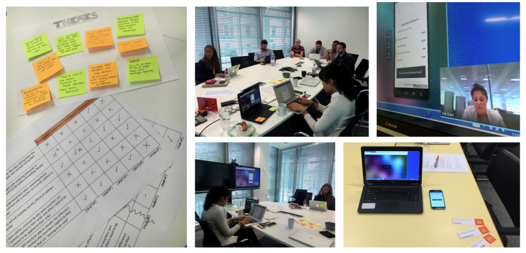
Once we had collected data from customer insights and from other areas of the business, familiarised ourselves with the Sainsbury’s personae, and done a competitor analysis of other e-commerce checkouts, we then moved on to ideation and thinking about what we wanted to implement. And what changes we needed to make to the current experience.
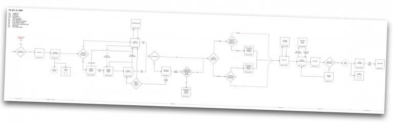
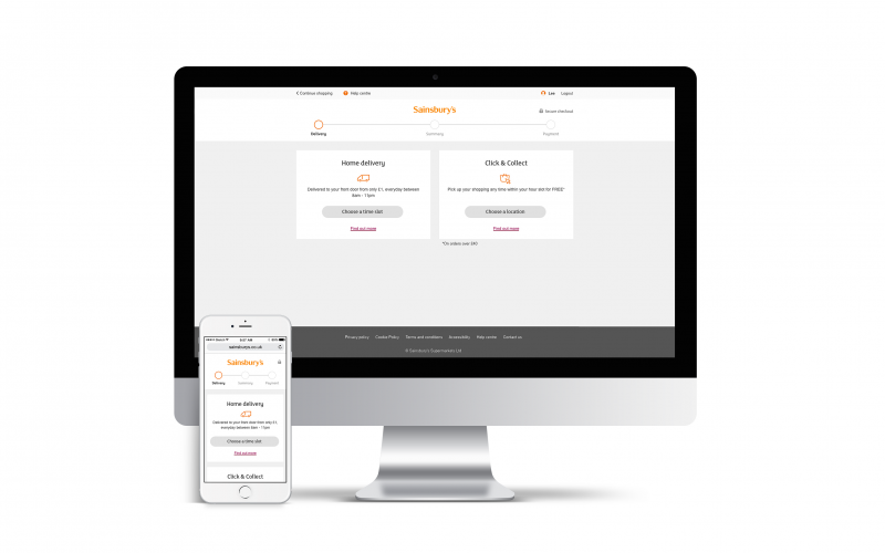
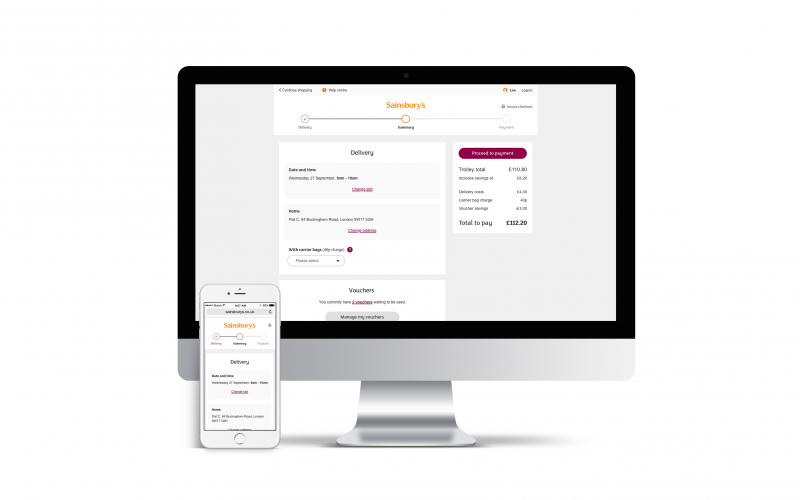
Sainsbury's Checkout user flows
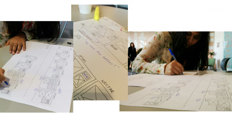
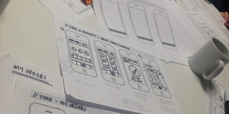
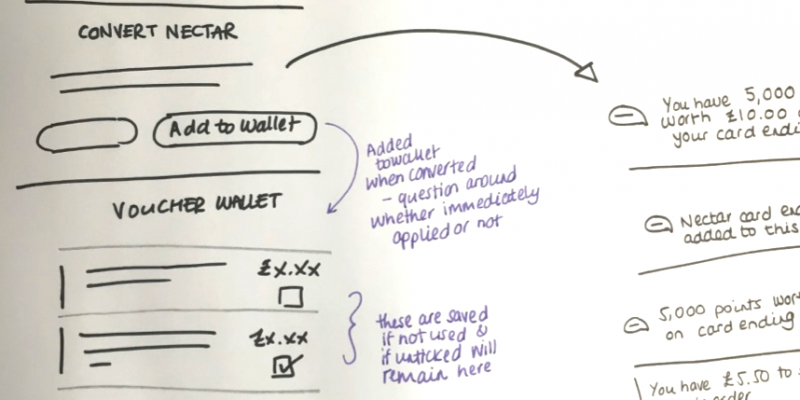
Despite all the digital tools there were, I much preferred to use pen and paper, and a lot of my time was spent doing this before putting together digital designs to then be reviewed and handed over to developers to build.
User testing
I ran regular user testing sessions, which is not unusual for products these days but back in 2015 this was the first user testing that had been run in the newly created product teams. So initially these were run with colleagues, to gain confidence from managers and convince stakeholders that user research was worth investing in. Once the stakeholders were onboard we then went on to run both lo- and hi-fi prototypes to continually validate what we were doing. I then went on to push these stakeholders and entire product teams to get involved in user research sessions – another first for Sainsbury’s digital. And it proved to be hugely successful and set an example for other teams and future projects.
Sainsbury's Checkout user testing session
Accessibility
I was also involved in having Robin Christopherson, an industry leading accessibility expert and blind user, come in to test the checkout experience, midway through build. Using a popular screenreader tool (NVDA) he tested the early building looking out for correctly labelled headings, ARIA landmarks/containers, content order and navigation, amongst other things.
This was important because ordering groceries online is something everyone uses, and is especially useful for those who with disabilities. Again this was the first time anything like this had happened at Sainsbury’s and was a first for myself too.
The outcome
Despite the successful build of the checkout and the recurring positive feedback from user testing, due to dependencies on other projects happening on and related to the groceries site, it was decided that this work on the checkout wouldn’t be released.
What I learnt
Although the project wasn’t delivered, there was a lot that I had learnt from this project. I had learnt the value of user research and the importance of having the whole team’s and especially the stakeholder’s ‘buy-in’ when it came to talking with users and having them test what we were building.
It was also a challenge to work within constraints of the existing site; such as maintaining the look and feel of the current for consistency, whilst still trying to make improvements to the experience. Although it was difficult it was managed by working very closely with the UI Designer and Product Owner, alongside having regular forums with the stakeholders where we discussed anything that might be compromising for the customer and to talk through any visual changes we were thinking of making.